Bootstrap icons — Overview
Bootstrap is a large and complex frontend library which we all fancy having some powerful functionality and customization built-in. Occasionally though, when you need to have icons in your web projects; you go straight to Font-awesome or Glyphicons (Bootstrap v3). But developers and designers often felt constricted to the fact that they have to rely on some other third party library for the icons having to pay for icons they desire. This just didn’t seem right for any of us.
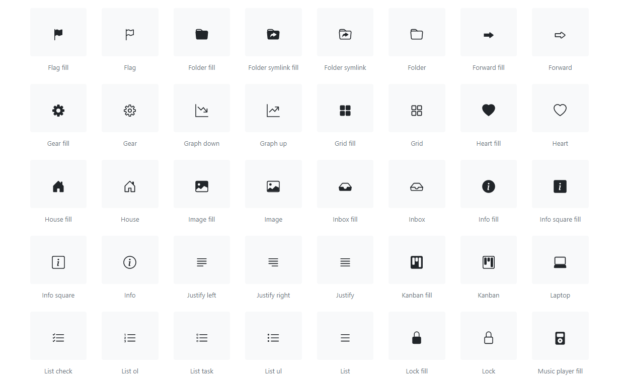
Fast forward 2019, gone are the days when we had to choose between Font-awesome or Glyphicons (Bootstrap v3), For the first time ever, Bootstrap has its own icon library, custom designed and built for its components… (navbars, button, cards, and more).
You can Track latest releases on GitHub here, also you can checkout Bootstrap icons documentation.
Getting started with npm
npm install bootstrap-icons
Download
Download the project from here, and from the icons folder and directly copy icons SVGs which you require in your project.
Usage
Choose how you would like to integrate Bootstrap icons in your web application.
External image
Use directly from the project directory and reference them like normal images with the <img> element.
Code:
<img src="/assets/img/bootstrap.svg" width="64" height="64" title="Bootstrap">Preview:

Embedded
Embed your icons within the HTML of your page (as opposed to an external image file). Here we’ve used a custom width and height.
Code:
<svg class="bi bi-chevron-right" width="64" height="64" viewBox="0 0 20 20" fill="currentColor" xmlns="http://www.w3.org/2000/svg">
      <path fill-rule="evenodd" d="M6.646 3.646a.5.5 0 01.708 0l6 6a.5.5 0 010 .708l-6 6a.5.5 0 01-.708-.708L12.293 10 6.646 4.354a.5.5 0 010-.708z" clip-rule="evenodd"/>
</svg>
Preview:

As CSS
You can also use the SVG within your CSS (be sure to escape any characters, such as # to %23 when specifying hex color values). When no dimensions are specified via width and height on the , the icon will fill the available space.
Code:
                           .bi::before {
                              display: inline-block;
                              content: "";
                              background-image: url("data:image/svg+xml,<svg xmlns='http://www.w3.org/2000/svg' viewBox='0 0 16 16'><path fill='none' stroke='%23333' stroke-linecap='round' stroke-linejoin='round' stroke-width='2' d='M5 14l6-6-6-6'/></svg>");
                              background-repeat: no-repeat;
                              background-size: 1rem 1rem;
                            }
Preview:

Styling
Color can be changed by setting a .text-* class or custom CSS:
Using bootstrap css classes
Code:
<svg class="bi bi-alert-triangle text-danger" width="64" height="64" viewBox="0 0 20 20" fill="currentColor" xmlns="http://www.w3.org/2000/svg">`

 ...

</svg>
Preview:

Using custom css classes
Code:
.my-custom-css-class{
                      color:green;
                    }
Preview:

Using Style Attribute
Code:
style="color:blue;"Preview:

See ya!
Original article on: https://blog.kushalbhalaik.xyz/bootstrap-icons-overview
